


The Importance of Responsive Web Design for a Seamless User Experience
In today’s digital age, where smartphones, tablets, laptops, and desktops are used interchangeably to access the internet, ensuring a consistent and optimal user experience across all devices has become paramount. This is where responsive web design steps in, revolutionizing the way we build and interact with websites. Adaptive web design is no longer a trend; it is a requirement. Let’s dive into why responsive web design matters and how it transforms the digital landscape.

What is Responsive Web Design?
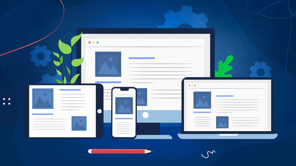
Responsive web design is a dynamic approach that aims to create websites capable of adapting to various screen sizes and devices. Rather than building separate websites for different devices, responsive design focuses on crafting a single website that adjusts its layout, images, and content to fit any screen. This technology-driven approach uses flexible grids, layouts, and CSS media queries to create fluid and dynamic web pages.
The Significance of Responsive Web Design
Enhanced User Experience in Responsive Web Design
At the core of RWD is an unwavering commitment to delivering an enhanced user experience. A responsive website ensures that users have a consistent and enjoyable experience regardless of the device they use. It eliminates the need for users to constantly zoom in, scroll, or pan to access content, making navigation intuitive and effortless.
Improved SEO
Search engines, such as Google, prioritize mobile-friendly websites in their ranks. This makes responsive design crucial for search engine optimization (SEO). By providing a seamless experience across devices, your website’s bounce rate decreases, and its organic traffic and engagement increase.
Cost-Effectiveness
In the early days of the internet, developers had to create separate versions of websites for desktop and mobile. Responsive design has significantly changed this landscape by streamlining the development process. Generating a single responsive website is less expensive than generating many versions for various devices. Maintenance becomes easier as well, as you only need to update one website instead of several.
Wider Audience Reach
With the proliferation of smartphones, people are accessing the internet from various devices and locations. A responsive website ensures that you can reach your audience no matter where they are or what device they use. This broadened accessibility can lead to increased brand exposure and customer engagement.
Faster Load Times
Websites must load rapidly for mobile users in particular. Responsive design often results in faster load times, reducing bounce rates and keeping visitors engaged. This is achieved through optimized images, efficient coding, and adaptive content delivery.
Future-Proofing Responsive Web Design
The digital environment is always changing. New devices with varied screen sizes and resolutions continue to appear. A responsive website will adapt to these changes without requiring a complete overhaul. This future-proofing aspect of responsive design can save time, effort, and resources in the long run.
Get More Information Mastering Off Page SEO for Enhanced Online Visibility
Implementing Responsive Web Design:
Flexible Grids and Layouts
Use relative units like percentages and ems instead of fixed units like pixels for widths and heights. This allows content to scale proportionally based on the screen size, ensuring a consistent layout and readability.
Media Queries
CSS media queries are at the heart of responsive design. They let you to use alternative designs and layouts dependent on the device’s specifications, such as screen width, orientation, and resolution. Media queries allow your website to gracefully adapt to various devices.
Fluid Images of Cross Platform Design
Images are a vital component of any website. To make them responsive, use CSS to ensure that images scale down proportionally to fit smaller screens. This prevents images from overflowing or getting cut off, maintaining the visual integrity of your content.
Mobile-First Approach
A mobile-first approach involves designing and developing for mobile devices first and then progressively enhancing the layout and features for larger screens. This ensures that the core content and functionality are accessible to all users, regardless of their device.
Conclusion
Responsive web design is not just about aesthetics; it’s about delivering a consistent and enjoyable user experience. As the digital landscape continues to evolve, catering to users across various devices is no longer optional. Responsive design ensures that your website remains accessible, engaging, and effective, regardless of the device your audience uses. Embrace the power of responsive web design to stay relevant and create a lasting impact in the digital realm. By adopting this approach, you’re not only adapting to the present but also preparing for the future of web browsing.