


The Art and Science of Color Theory: A Palette of Possibilities
Color is more than just a visual phenomenon; it’s a language of emotions and expressions, an essential element of design that influences how we perceive the world. In this blog, we’ll embark on a journey into the mesmerizing realm of color theory, exploring the science, psychology, and artistry behind the harmonious hues that surround us.
Understanding Color Theory: A Science and an Art
At its core, color theory is both a science and an art. It’s the study of how colors interact, blend, and create visual harmony or contrast. Whether you’re a designer, artist, or simply curious about the magic of colors, delving into Color science can provide valuable insights into the principles that underlie all visual compositions.
The Basics of Color Theory
To comprehend Color mixing, we must first understand the basic building blocks of color:
Primary Colors
These are the foundational colors from which all other colors are derived. In traditional Color aesthetics the primary colors are red, blue, and yellow.
Secondary Colors
Secondary colors result from mixing two primary colors. They include green, orange, a purple.
Tertiary Colors
Tertiary colors are created by mixing a primary color with a neighboring secondary color, resulting in shades like red-orange or blue-green.
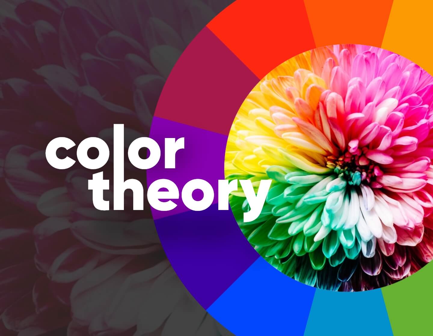
Color Wheel
The color wheel is a visual representation of the relationships between colors. It helps us understand concepts like complementary, analogous, and triadic color schemes.
The Psychology of Color Theory
Colors have the power to evoke emotions, trigger memories, and influence behavior. This is where the psychology of color comes into play. Different colors can evoke different feelings and responses in people, and understanding these psychological associations is crucial in various design and marketing contexts.
Red in color theory
Associated with passion, energy, and urgency, red can stimulate appetite and attention.
Blue
Often linked to calmness and trustworthiness, blue is a popular choice for corporate branding.
Yellow
Yellow radiates positivity, warmth, and happiness, making it suitable for cheerful and inviting designs.
Green
A symbol of nature, growth, and harmony, green is often used in eco-friendly and health-related contexts.
Purple
Purple is associated with luxury, creativity, and mystery, making it a popular choice in high-end branding.
Orange
A color of enthusiasm and energy, orange can create a sense of urgency and excitement.
Pink
Pink is often associated with romance, innocence, and sweetness.
Must Read About Unlocking the Power of SEO Optimization: Boosting Your Online Presence
Creating Harmonious Color Compositions
In design, achieving a harmonious color composition is a delicate art. Different color schemes, such as complementary, analogous, and triadic, can be used to create visual balance and evoke specific emotions. Complementary colors, for example, are opposite each other on the color wheel and can create contrast and vibrancy when used together.
color theory in art
Color theory is fundamental in the realm of art, serving as a cornerstone for artists to express their creativity and emotions. It explores the interactions between colors, the emotional impact of each hue, and the principles of color harmony and contrast. Artists leverage this knowledge to convey mood, depth, and meaning in their artworks, whether through the bold, contrasting colors of abstract expressionism or the subtle, harmonious tones of impressionism.
Color schemes in colors theory
Color schemes are essential in design, as they define the overall look and feel of a project. They consist of carefully selected colors that work harmoniously together. Whether it’s a monochromatic scheme for simplicity, complementary colors for contrast, analogous colors for a harmonious blend, or a triadic scheme for vibrancy, the choice of color scheme can greatly influence the visual impact and emotional resonance of a design.
Color theory in fashion
Color theory plays a pivotal role in the world of fashion, guiding designers in creating clothing that resonates with personal style and cultural trends. It involves the careful selection and combination of colors to evoke emotions and set the mood for a collection or outfit.
Applications of Color Theory:
Color science finds applications in various fields:
Graphic Design in Colors Theory
Graphic designers use color theory to create visually appealing and effective designs for marketing materials, websites, and more.
Interior Design
Interior designers consider Color relationships when selecting paint, furniture, and decor to create cohesive and mood-enhancing spaces.
Fashion
Fashion designers use Color harmony theory to create clothing collections that convey specific themes and moods.
Marketing
Marketers leverage the psychology of color to influence consumer behavior and brand perception.
Advantages of colors theory
Color theory offers numerous advantages in various fields such as art, design, psychology, and marketing. Understanding the principles of color theory allows artists and designers to create harmonious and visually pleasing compositions. It provides a structured framework for selecting color palettes, which can evoke specific emotions or convey particular messages. In psychology, color theory is used to study the impact of colors on human emotions and behavior, aiding in therapeutic applications.
Conclusion: The Artistry of Color Theory
Color theory is a bridge between science and art, offering insights into the principles that govern our visual world. Whether you’re designing a website, decorating a room, or creating a work of art, understanding Chromatic theory empowers you to make intentional choices that resonate with viewers on an emotional level. It’s the language of hues, the poetry of pigments, and the artistry that adds depth and meaning to our visual experiences.