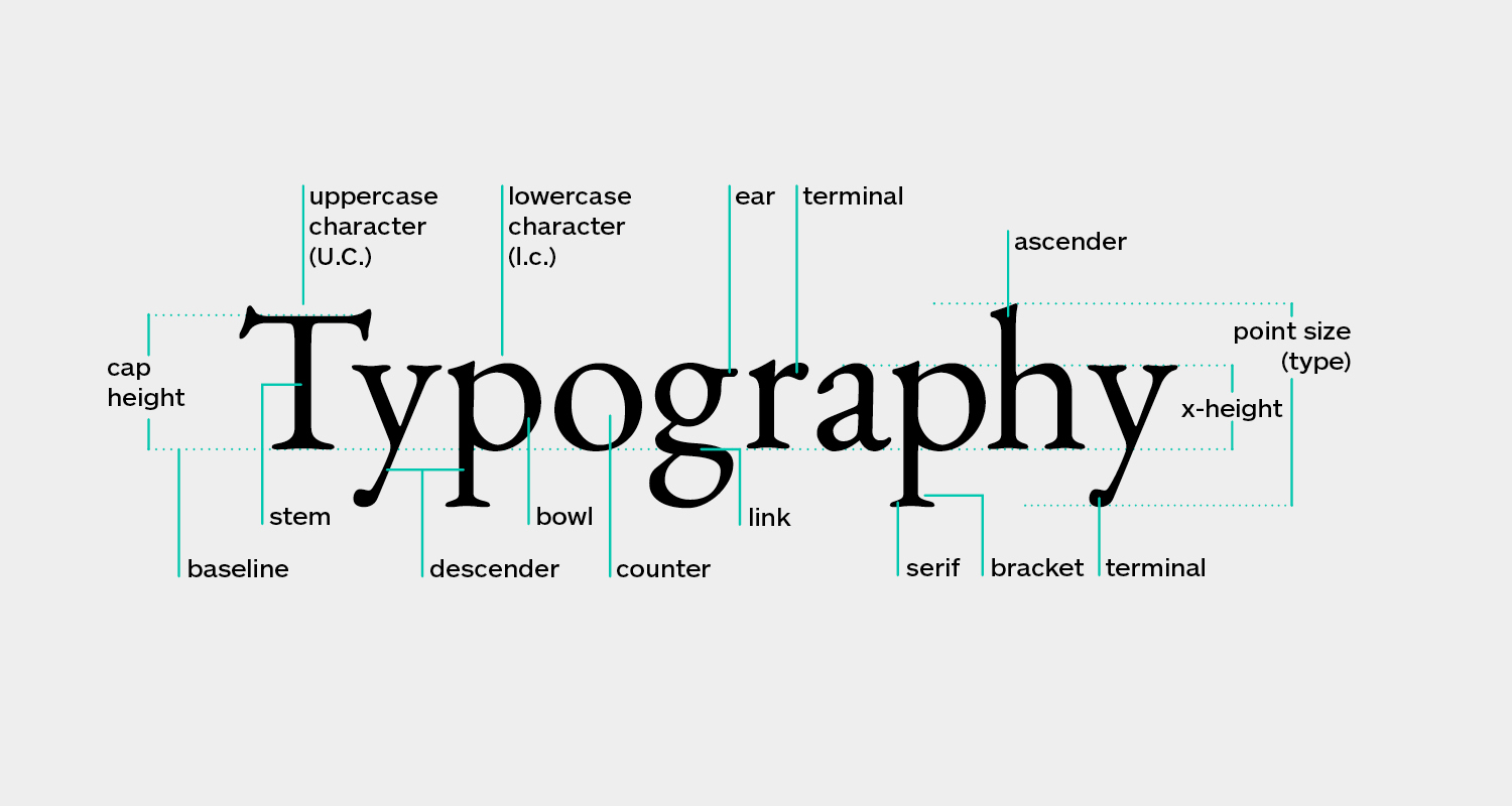
Typography is more than just a means of displaying text
Typography is more than just a means of displaying text; it’s the art of shaping words and emotions. It’s a journey into the realm of fonts, typefaces, and letterforms that can evoke feelings, convey messages, and create powerful visual experiences. In this blog, we’ll immerse ourselves in the world of typography, exploring its significance, the history of fonts, and the profound emotional impact it has on design.
Typography: Beyond the Basics
Typography isn’t merely about selecting fonts. It’s about the meticulous arrangement of letters, characters, and symbols to create a harmonious and visually pleasing composition.Font design involves choosing the right typeface, setting the appropriate font size, adjusting spacing, and considering overall layout. It’s the silent storyteller that significantly influences readability, aesthetics, and the emotions conveyed through design.

A Journey Through Typography’s History
The history of typography is a fascinating journey that spans centuries. It begins with the painstaking efforts of scribes who meticulously transcribed manuscripts by hand. However, a pivotal moment in typography’s history arrived with Johannes Gutenberg’s invention of the printing press in the 15th century. This revolutionary invention made it possible to mass-produce books and transformed Typecraft into a central element of communication.
As technology advanced, typography made the transition from the print era to the digital age. Computers and design software opened up a vast world of fonts and the ability to manipulate text with precision. Typography became accessible to all, not just skilled craftsmen.
The Emotional Impact of Typography
Typography goes beyond aesthetics; it has the power to convey emotions. The choice of typeface can evoke a spectrum of feelings. A bold, angular font may communicate strength and urgency, while a flowing, cursive script might evoke elegance and nostalgia. Designers use Word styling as a subtle yet potent tool to align visuals with the intended emotional impact.
Typography in Branding: Crafting Identity
Branding heavily relies on typography to create a lasting impression. Companies carefully select fonts that represent their identity. Consider the distinctive script font of the Coca-Cola logo; it’s instantly recognizable and synonymous with the brand. Text composition helps convey a brand’s personality, whether it’s modern and innovative or classic and dependable.
Must Read About Unleashing Creativity: The Artistic Wonders of Digital Art
Practical Tips: Crafting with Precision
Whether you’re a seasoned designer or an aspiring one, here are some practical tips to harness the power of typography:
Select Fonts Mindfully
Choose fonts that align with your project’s message and purpose. Try out many typefaces until you discover the right one.
Prioritize Readability
Ensure that your text is easy to read. Pay attention to font size, line spacing, and color contrast.
Establish Hierarchy
Create a clear hierarchy in your typography to guide the reader’s eye. Use different font sizes and styles for headings, subheadings, and body text.
Master Kerning and Tracking:
Pay close attention to kerning (adjusting space between individual characters) and tracking (adjusting space between all characters in a word) to enhance text appearance.
Consistency is Key: Maintain consistency in typography across your design projects to build a strong corporate identity.
In conclusion, typography is a blend of creativity and precision, transforming words into visual masterpieces. With a rich history, emotional depth, and practical applications across various design fields Letter art is an essential tool for any designer. Whether you’re crafting a website, a poster, or a book, remember that typography is the silent conductor that can make your message resonate with style and precision.


